
new classic.
For this project, I designed the logo and full brand identity for new classic., a fictional vintage apparel company inspired by retro aesthetics and timeless fashion. My goal was to create a cohesive visual identity that captures the nostalgic charm of vintage style while maintaining a modern, versatile appeal.


Concept Overview
For new classic., I aimed to capture the essence of vintage fashion while incorporating a modern, fresh appeal. The goal was to create a visual identity that resonates with individuals who appreciate timeless styles but embrace contemporary trends.
Design Inspiration
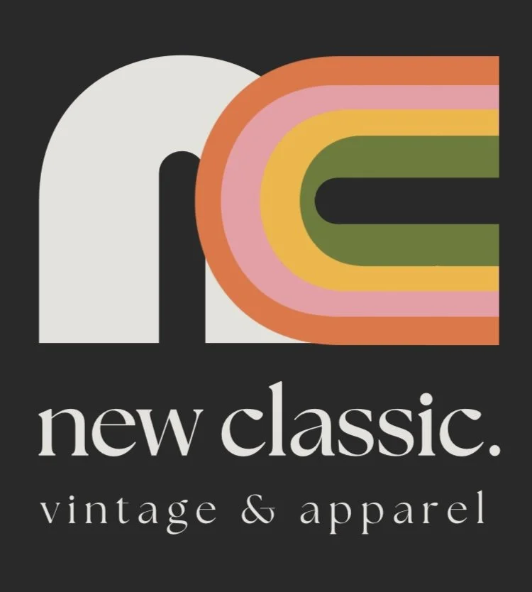
The logo design is inspired by the retro aesthetics of the '70s and '80s, an era known for its bold colors, geometric shapes, and expressive typography. I wanted to reflect a sense of nostalgia while ensuring a clean and adaptable design that could easily fit into modern branding needs. I also needed the scalability to remain readable in both small and large print, so I kept the design simple and blocky.
Typography & Style
I chose a sleek, lowercase serif typeface for the brand name to convey a sense of sophistication and timelessness. The combination of "new" and "classic" in the name is reinforced by the type choices—balancing the old and the new. The tagline, “vintage & apparel,” is set in the same, elegant serif font.
Color Palette & Symbolism
The vibrant gradient within the “nc” monogram reflects the iconic retro color schemes—warm oranges, muted yellows, and olive greens—bringing a touch of nostalgia. These colors were carefully selected to evoke feelings of warmth and familiarity while maintaining a playful yet sophisticated look. The soft beige and black contrast in the background allows the vibrant colors to stand out without overwhelming the viewer.
Logo Mark & Versatility
The monogram “nc” serves as a strong visual identifier that can stand alone in various applications, from clothing tags to digital media. Its rounded, smooth edges soften the look, making it approachable and friendly, while the stacked color bands create a sense of movement and energy.
Brand Application
To complement the logo, I curated a set of lifestyle elements—denim, straw textures, and neutral accessories—to represent the brand’s target audience: stylish individuals who embrace vintage aesthetics with a contemporary twist. The branding is designed to be flexible across different mediums, from packaging to social media and print.